Parth Gaur - Work
Redesign of "Where is my train"
An application for tracking the live status of trains run by Indian Railways.
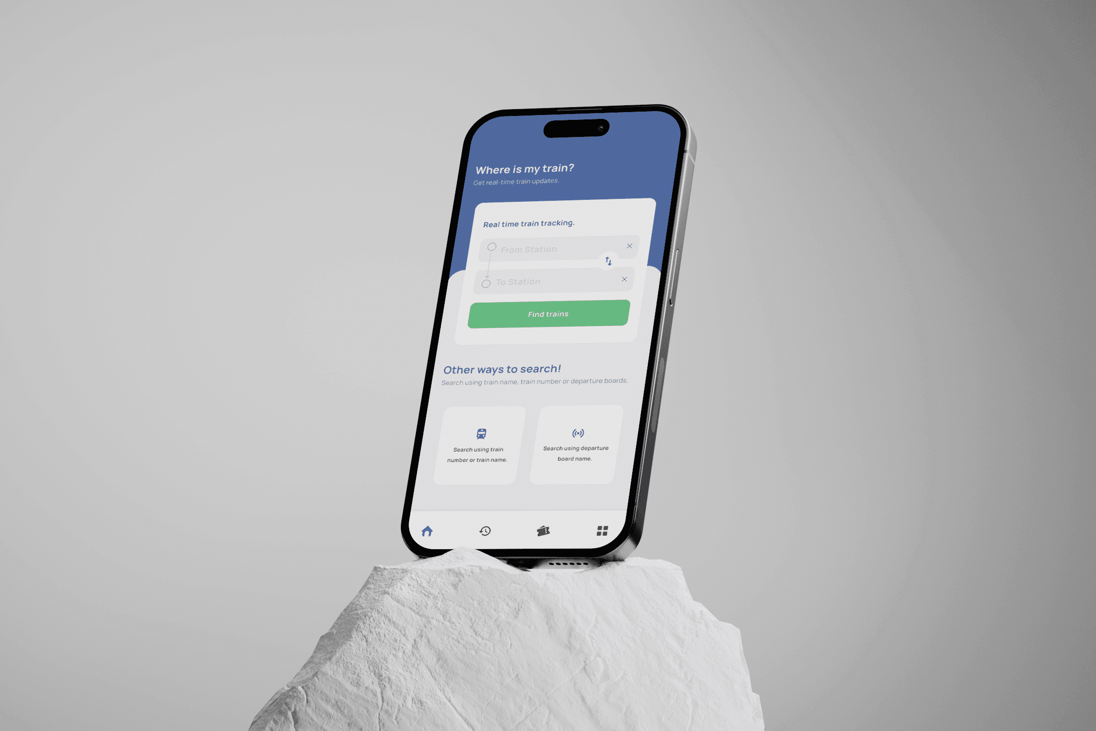
Problem Statement
The Where Is My Train app is widely used by millions of people. Despite its popularity and reliability, the app’s UI is outdated, cluttered, and lacks modern design principles. Users struggle with information overload, navigating through unstructured data, and understanding train statuses quickly.
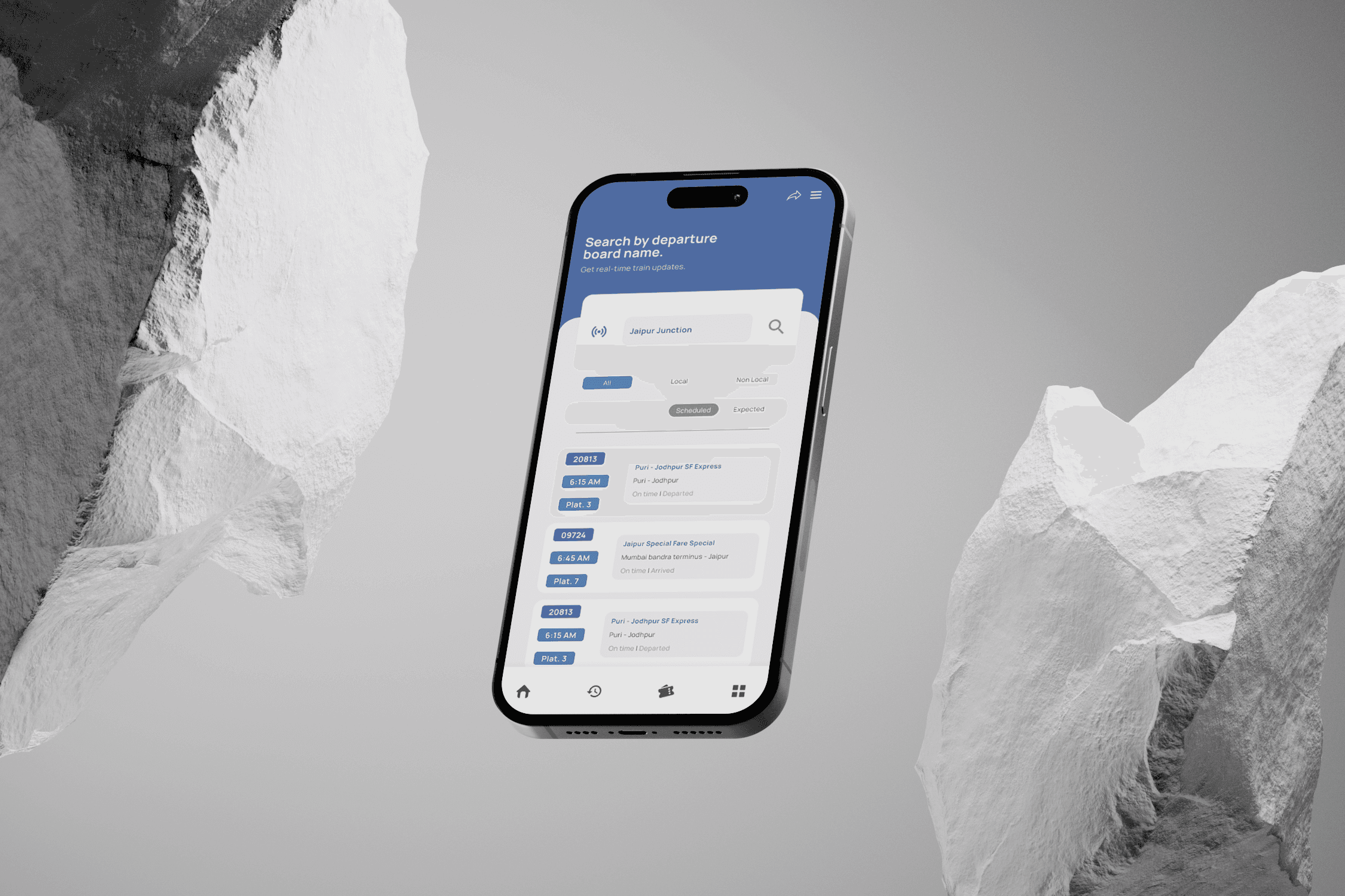
Goals
Simplify the train tracking process with clear and easy-to-navigate interfaces.
Improve the readability of key information such as live train statuses and schedules.
Enhance accessibility for users with visual impairments or low-tech skills.
Research
Key Research Insights:
Overwhelming Interface: Users frequently mentioned that too much information is presented at once, which makes it difficult to quickly find what they need.
Poor Visual Design: The app feels dated and visually heavy, especially with small fonts and low color contrast.
Unintuitive Flow: The process of searching for a train, checking live statuses, and booking tickets could be smoother and more intuitive.
Accessibility Issues: Some older users mentioned that small fonts and cluttered design made the app harder to use.
Competitor Analysis:
IRCTC Rail Connect: Functional, but its interface is even more complex and overwhelming. The app has a cluttered design with a lack of clarity.
RailYatri: Easy to navigate, but the design is inconsistent, and the app lacks the robust offline mode of Where Is My Train.
User Research Questions:
What aspects of Where Is My Train do you find most frustrating?
How easy is it for you to check your train status in the current app?
What features or improvements would you want in a redesigned version?
How often do you experience difficulty navigating through the app?
Do you have any issues with font size, color contrast, or readability?
Outcome and Reflections
Outcome:
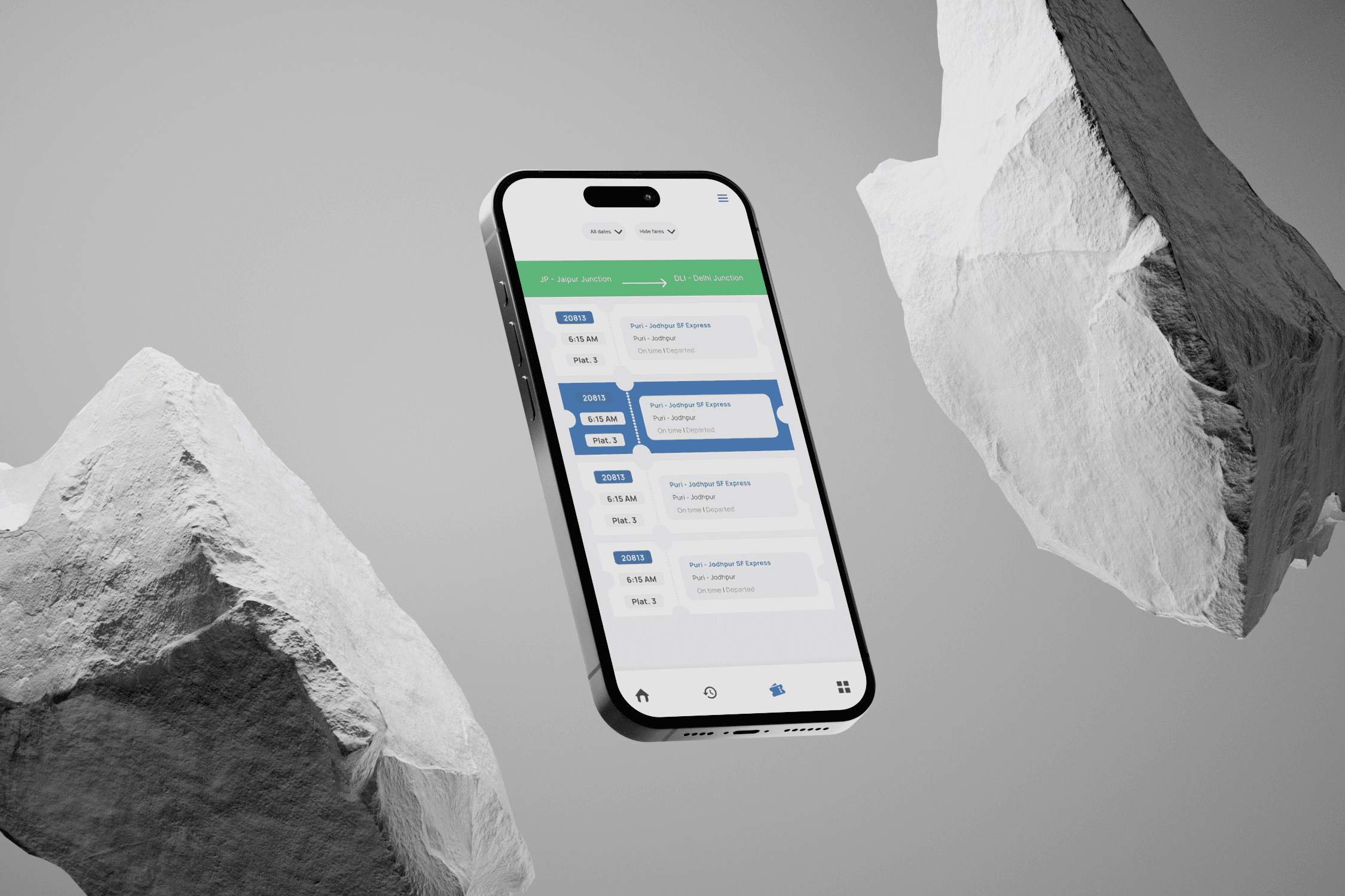
The redesigned Where Is My Train app now has a simplified and more intuitive interface that caters to all user types, from low-tech users to frequent travelers.
Feedback from usability testing highlighted that users found the new design easier to navigate, with clearer hierarchy and quicker access to key information.
What I Learned:
Prioritize Key Information: Making key train information (like status and platform) prominent significantly improved user satisfaction.
User-Centered Design: Accessibility improvements like larger fonts and simplified navigation are crucial for low-tech users, especially in essential apps like this